The common perception among our citizens that our ice cream (and chocolate) is the most delicious in the world significantly influenced Nestlé's strategic approach to entering the domestic market with its products.
This certainly reflected in the recipes as well (though I can only hypothesize this based on indirect indicators).
The assignment—to develop the naming, packaging design, and advertising campaign—was entirely based on this national pride in the domestic food industry.
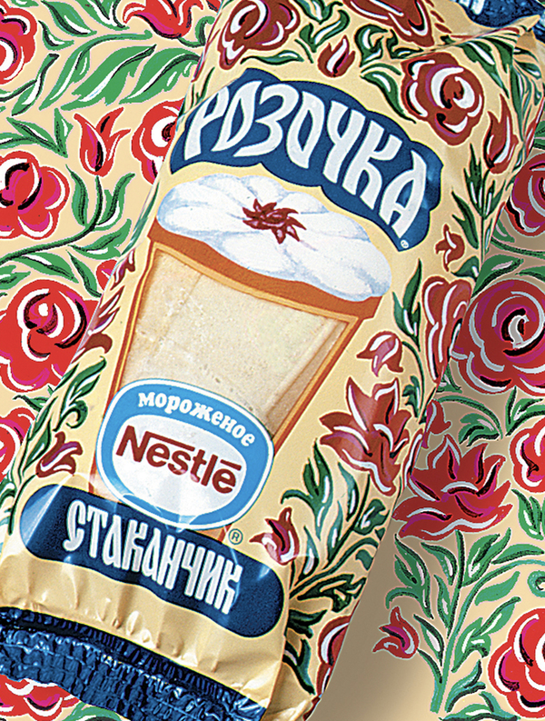
After testing every possible name option (you can try playing this game yourself), the idea emerged to use names that evoked associations with products well-known to people of the Soviet era. Specifically—a block of ice cream costing 48 kopecks, ice cream sold in large department stores like GUM and Detskiy Mir: ice cream in a wafer cone, and the same cone, but with a creamy rose design.
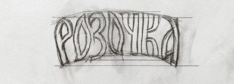
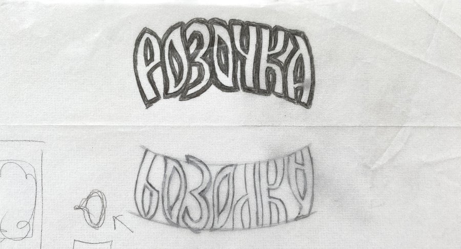
This led to the names: 48 Kopecks, Rosochka, and Stakanchik.
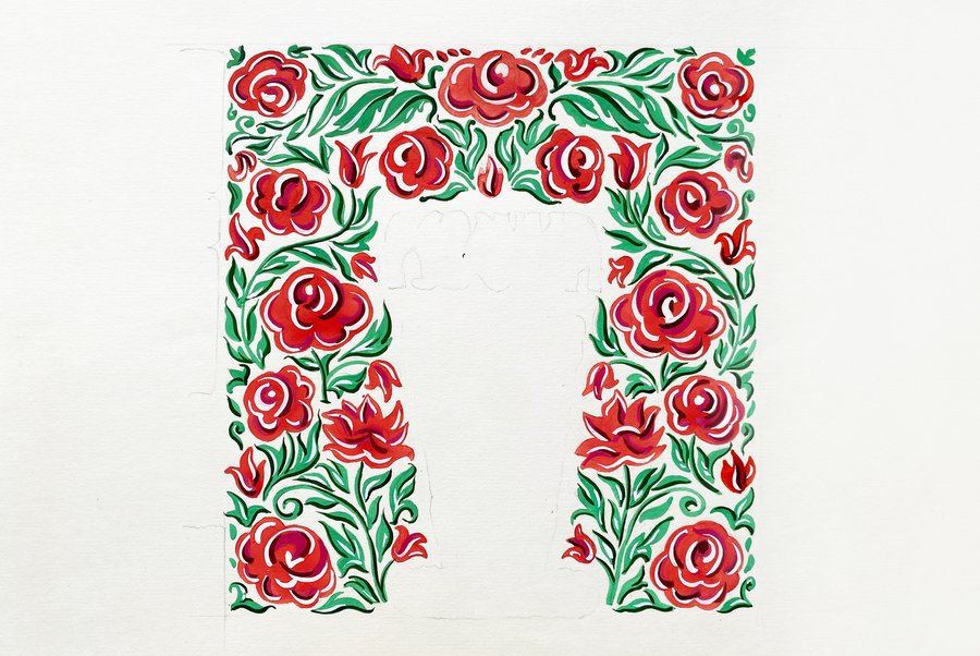
A similar challenge—imitating the Soviet aesthetic style—was set for the artistic realization of the packaging. A mandatory condition was that the work had to be exclusively handmade.
No computer.
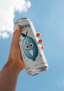
And here is the result.