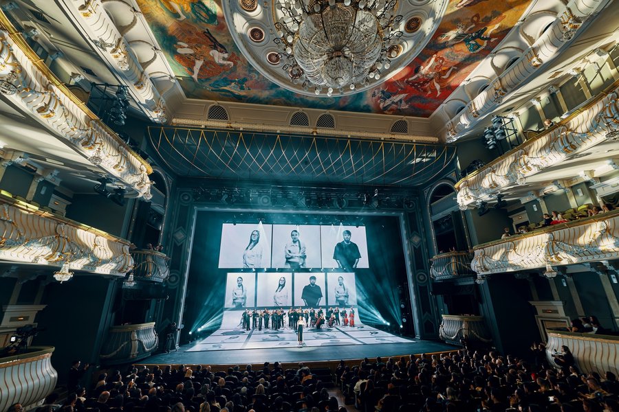
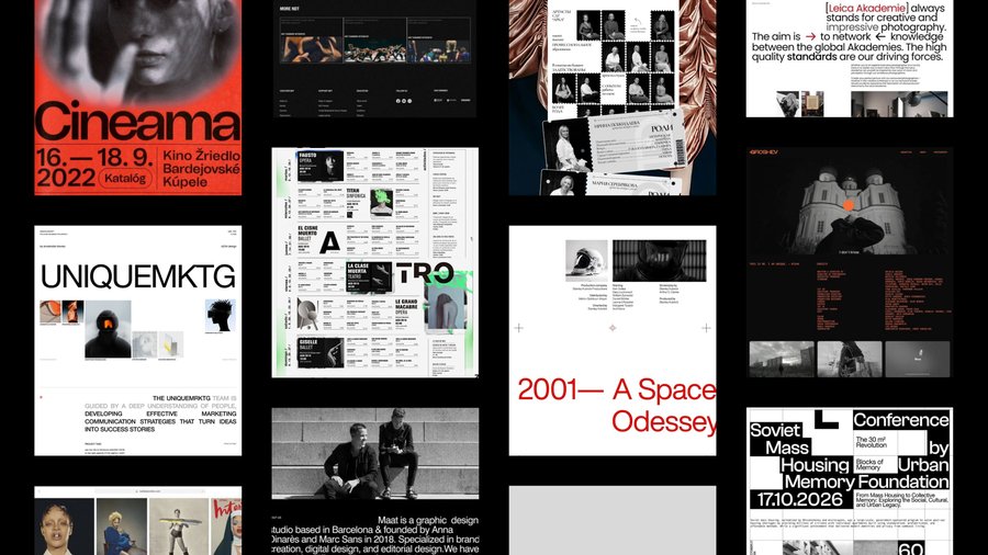
We looked at the various types of web applications—usually, these are simple pages without a strong design presence. The options with small, vibrant accents and plenty of white space resonated the most. Next, we selected a grid system and arranged the elements according to it.
Silence is associated with the ticking of a clock, and ticking is associated with a period. That’s how this effect emerged in the program. As you scroll down, it grows and gradually fills the entire screen.The longer you are silent, the more space the unspoken takes up. Silence either bursts through or retreats inward. Also, a period signifies the end of a phrase—when a period is placed, the conversation has ended.
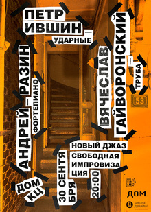
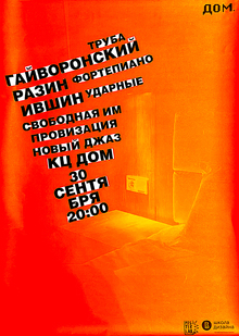
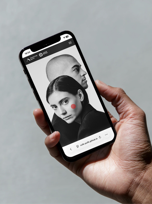
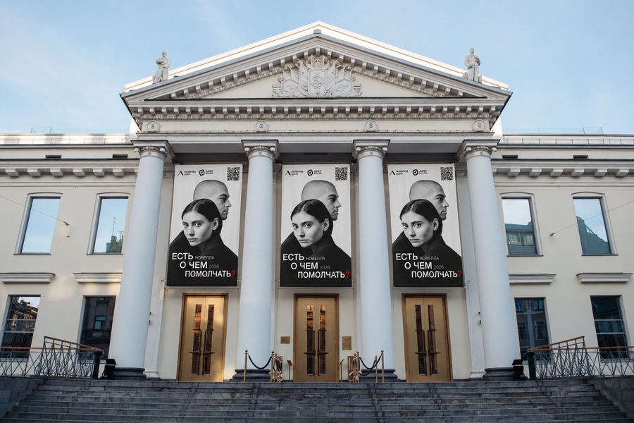
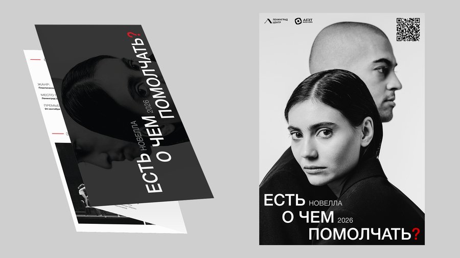
A unified system of three carriers was created: a mobile web application accessible via QR code, a printed booklet, and a poster. All essential information is included within—the novella description, the director’s statement, stage photos, and the team roster. The web version has been designed and is live via the provided link.