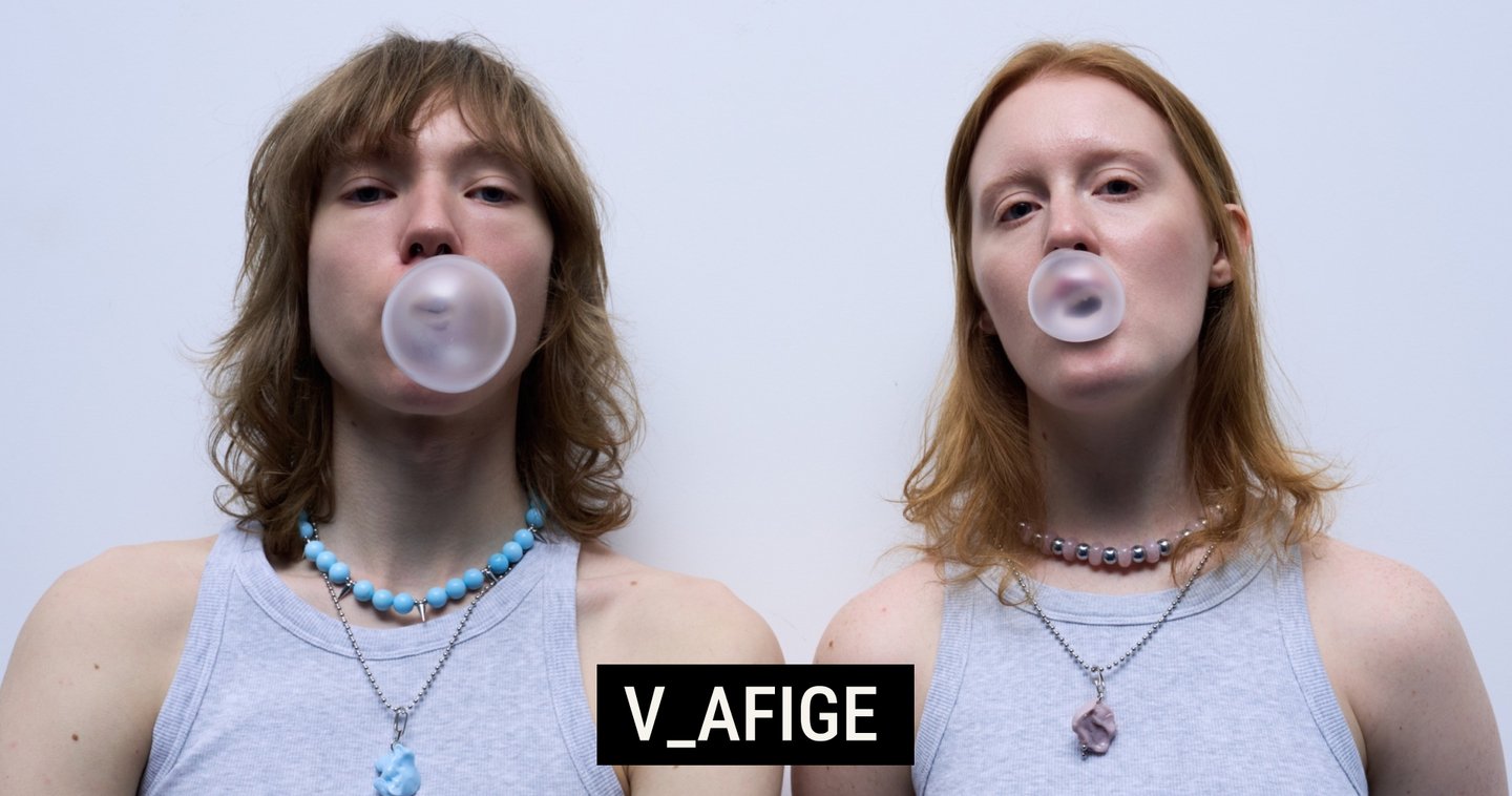
INTRODUCTION
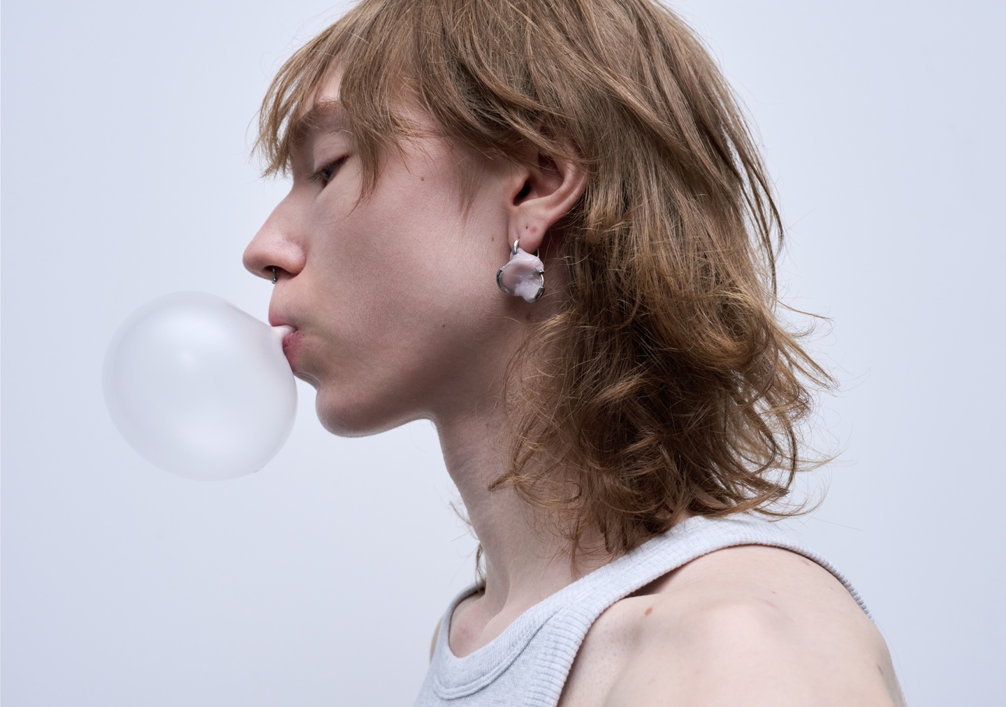
BRAND POSITIONING
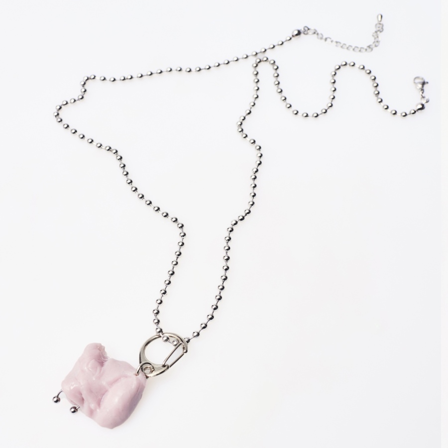
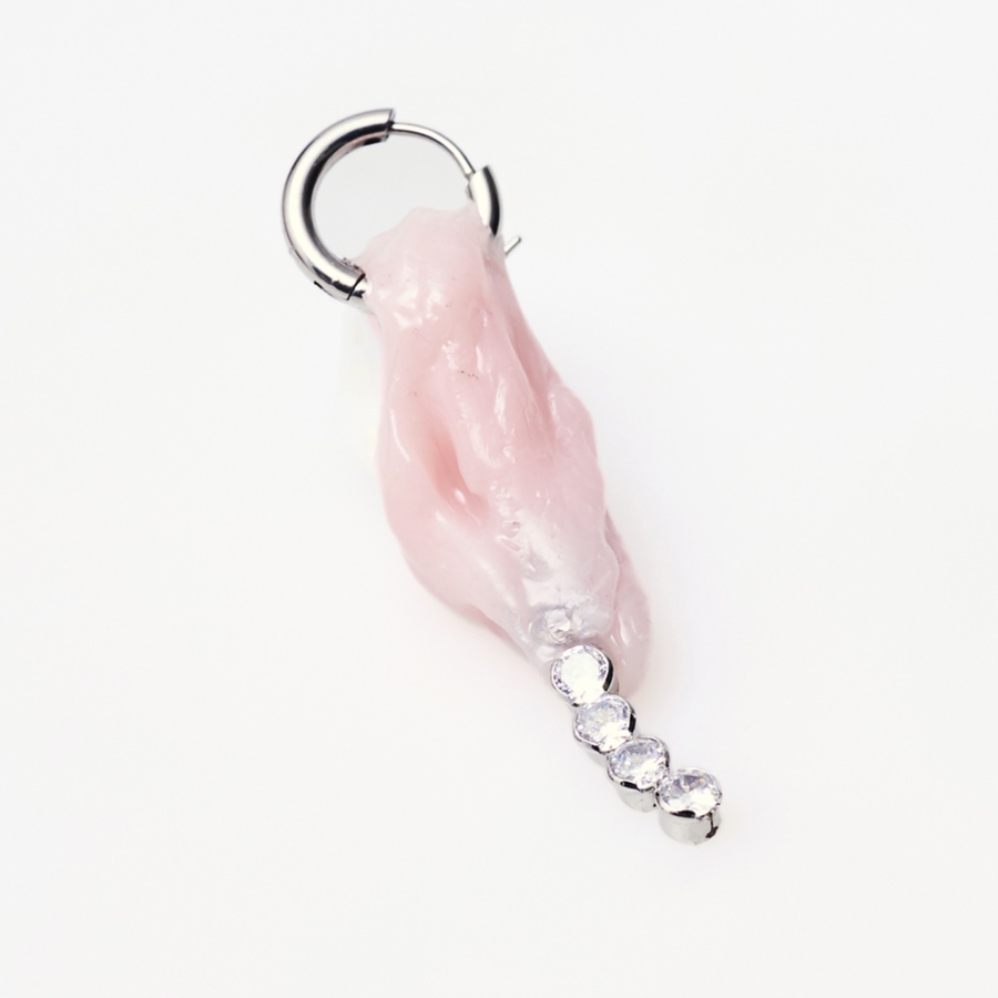
V_AFIGE is an independent Russian jewellery brand that combines original design and experimental fashion. The brand offers an alternative to mass-market accessories, focusing on unusual shapes, handmade production and limited quantities. The main idea of V_AFIGE is based on two different styles: PROSTOE and SLOJNOE. PROSTOE focuses on simple shapes and small details, while SLOJNOE offers bold and creative jewellery that can become the main part of an outfit. Together, these two styles allow the brand to offer different ways of creating a personal look.
What makes V_AFIGE special is not only its original design, but also the way it sees jewellery as a part of personal style. Some pieces are easy to wear every day, while others can completely change an outfit. Each piece is handmade and produced in small numbers, making the jewellery more personal and unique.
V_AFIGE positions itself as a brand that combines everyday jewellery with creative and unusual designs through two different styles.
TARGET AUDIENCE
People aged 18–35 who are involved in modern visual culture, fashion, art, and creative communities. They are united by an interest in individuality and unconventional self‑expression.
VISUAL IDENTITY
The visual identity of V_AFIGE is based on the idea of «soft grunge», which combines bold, experimental graphics with minimalism and visual simplicity. This combination reflects the main idea of the brand: bringing together two different styles, PROSTOE and SLOJNOE, in one design language.
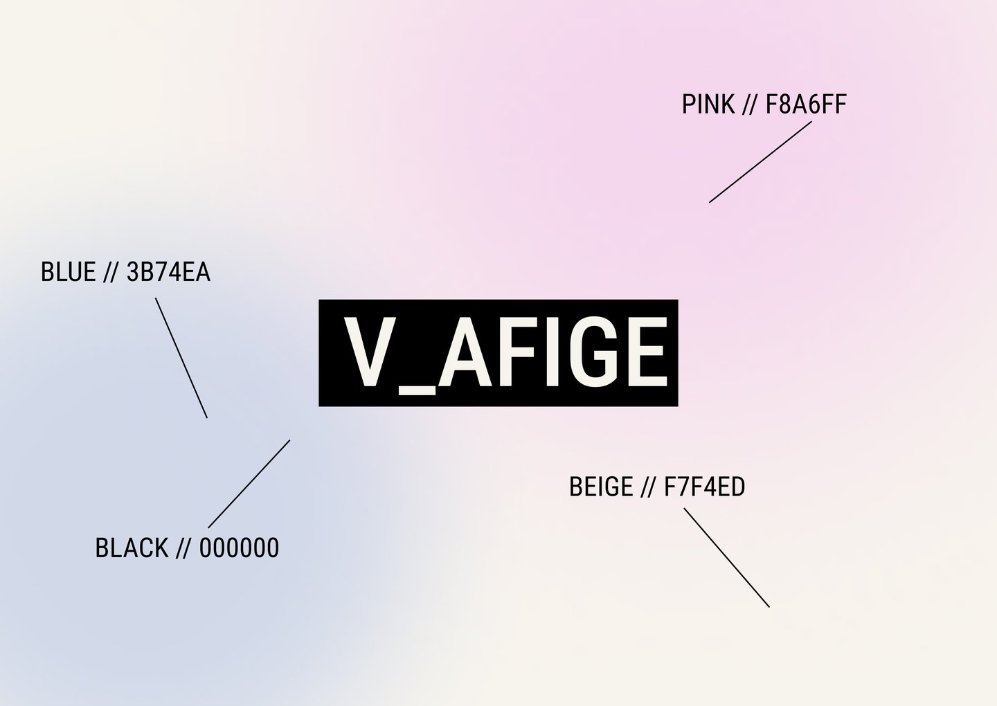
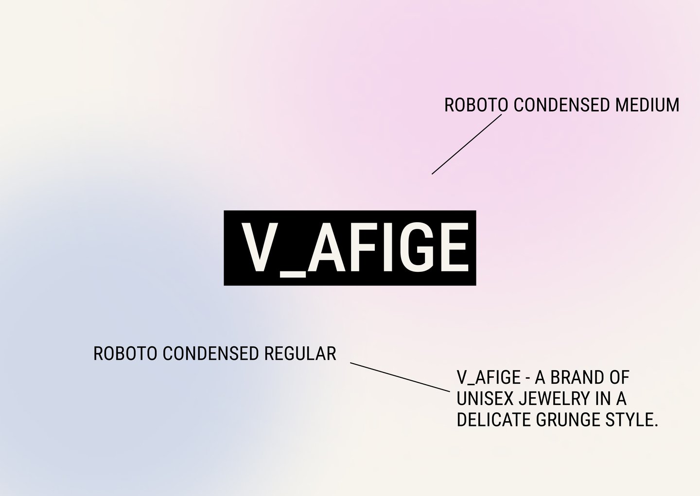
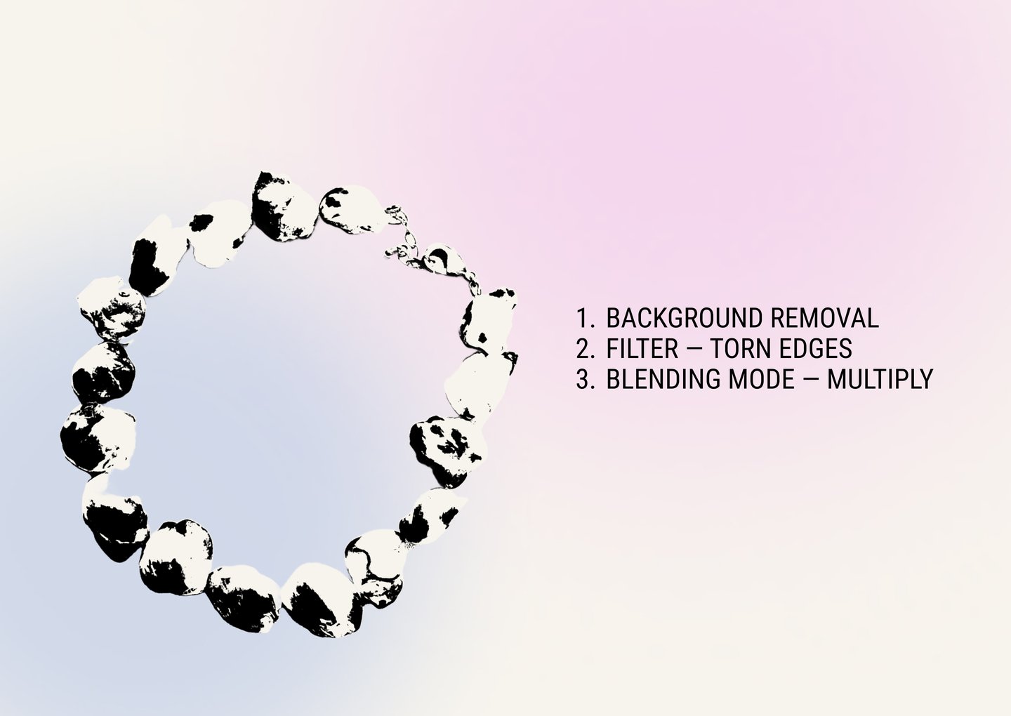
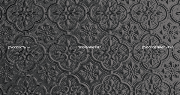
The graphic style uses strong, tilted typography, rough textures and open space. Bold shapes and unusual compositions create a feeling of independence and creativity, while a limited colour palette and simple layouts help keep the design balanced. In this way, the contrast between simplicity and complexity appears not only in the jewellery collections but also in the brand’s visual communication.
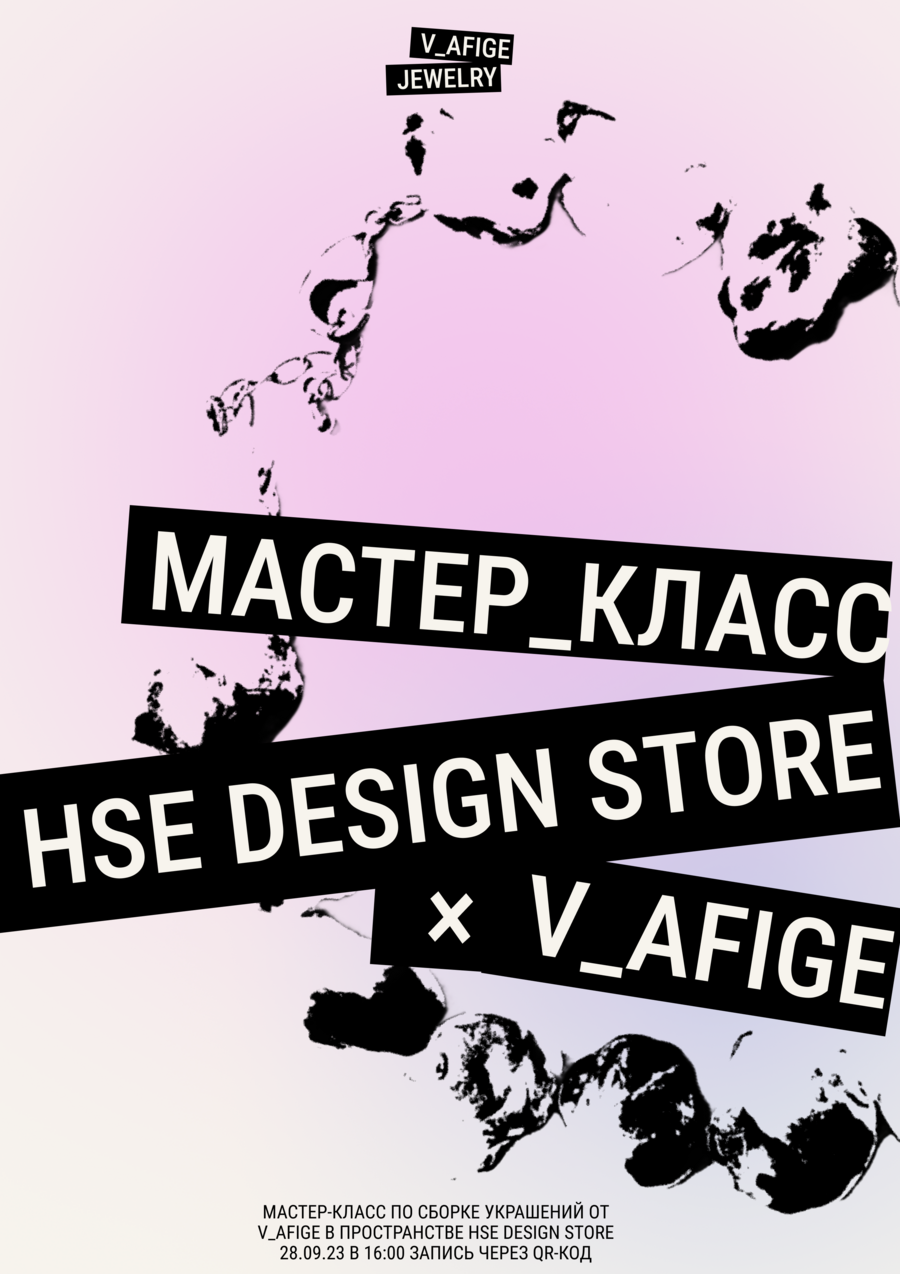
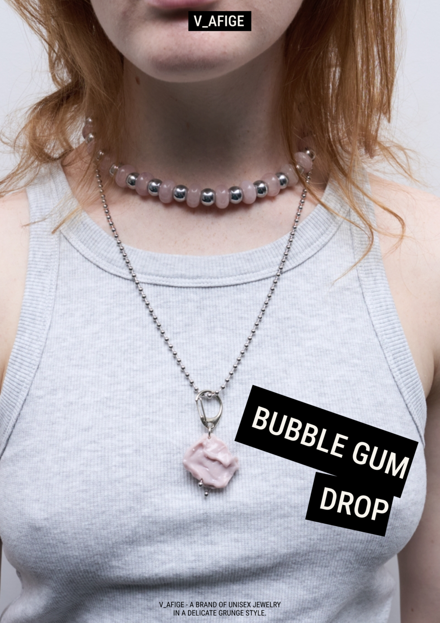
As a result, the visual identity becomes a part of the brand’s product strategy. Minimalism reflects the simplicity and everyday use of PROSTOE, while experimental graphics support the bold and creative character of SLOJNOE. Together, these elements create a clear and recognisable identity. The main goal of V_AFIGE’s visual identity is to show how the brand is different from mass-market accessories and traditional jewellery brands, making original design and freedom of self-expression its key values.
PROSTOE
PROSTOE is the everyday jewellery line of V_AFIGE. Its main goal is to create simple, wearable pieces that add character to an outfit without becoming its main focus.
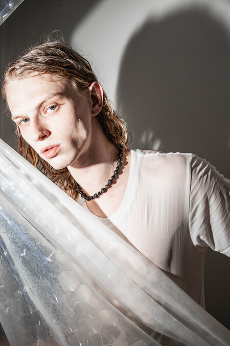
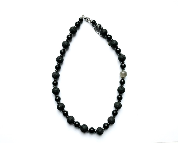
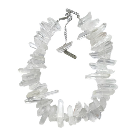
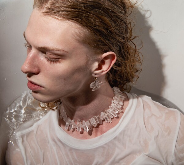
The challenge is to make everyday jewellery both versatile and visually distinctive. PROSTOE achieves this through thoughtful shapes, proportions and subtle details.
SLOJNOE
SLOJNOE is the experimental jewellery line of V_AFIGE, combining unconventional shapes, artistic concepts and bold design solutions. Unlike PROSTOE, these pieces are designed to attract attention and become the main visual element of an outfit.