
Introduction
There are many language-learning apps on the market today, but only a few manage to become part of popular culture. Duolingo is one of those rare cases where an educational service has gone beyond its functional role and turned into a widely recognizable media image.

Even people who have never used the app often recognize the green owl Duo through memes, ads, or casual internet references. This already suggests that the brand’s communication works not only inside the product but also within a broader cultural space.
This work explores how Duolingo builds its communication strategy and why its image has become so stable and recognizable.
Brand Positioning and Perception
Duolingo positions itself as an accessible language-learning platform. Its main idea is to make learning simple, consistent, and non-intimidating for users. At the same time, the brand deliberately avoids an academic or overly formal tone. Instead, it builds communication around lightness, play, and continuous interaction with the user.

Compared to traditional educational platforms, Duolingo clearly avoids the role of a “teacher.” Instead, it offers a softer model of interaction where the user does not feel pressure or judgment. This approach helps create a more comfortable learning environment and encourages users to stay engaged with the platform over time.
Communication Channels
The main channel of interaction is the app itself. This is where the core user experience is formed. The interface is designed to constantly reinforce the feeling of progress and movement forward.
The website plays a secondary role and mostly repeats the visual language of the app, maintaining brand consistency.
A particularly interesting aspect is Duolingo’s presence on social media and in digital culture. Here the brand actively uses humor, memes, and self-irony. This sharply contrasts with most educational services, which usually maintain a neutral and serious tone.
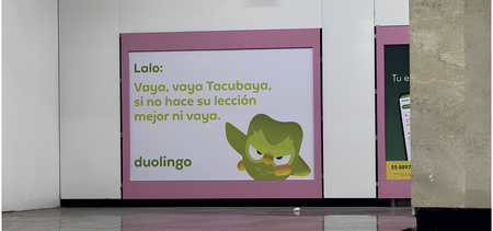
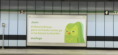
Duolingo’s advertising campaigns also heavily rely on the character Duo, who becomes the central figure across external communication channels.
Theoretical Framework
Two theoretical perspectives are useful for analyzing Duolingo’s communication. The first is semiotics, which allows visual elements to be interpreted as signs that generate meaning for the audience. Through this approach, colors, symbols, characters, and interface design can be examined as tools that shape users’ perceptions of the brand.
The second perspective is brand personification theory, which explains how a company can be perceived not as an organization but as a character with emotions and personality traits. This framework is particularly relevant to Duolingo, as the brand actively communicates through its mascot and social media presence, creating a more personal and emotionally engaging relationship with users.
In Duolingo’s case, both theories work together: visual elements create a stable system of signs, while the character Duo turns the brand into an active participant in communication.
Communication Analysis
One of the key elements of Duolingo’s communication is the owl character Duo. Formally, it is a brand mascot, but in practice it functions as an independent media character. Duo appears in the app, advertising, social media, and even internet memes. Over time, it stops being perceived as a simple interface element and starts existing as a standalone character.
From the perspective of brand personification, this reduces the distance between the company and the user. Instead of interacting with an abstract organization, users interact with a character that has emotions and behavioral patterns. This makes communication more personal and engaging.