The branding for KID: napped is a blend of childlike innocence and manufacturability of the modern world, capturing the essence of the brand’s handcrafted products in a way that is fresh, dynamic, and visually striking. The use of AI-generated images adds a high-tech touch to the branding, while the unique font created specifically for the brand adds a personal, handmade feel. The juxtaposition of bold, dynamic forms with naive, organic shapes creates a compelling tension that draws the eye and captures the imagination. This reflects the brand’s commitment to using the latest technology to create traditional handcrafted goods, resulting in a branding that is both authentic and innovative. Overall, this branding set the company apart in a crowded marketplace and position it for success.

Original size 4000x2250
Loading...
Original size 4001x2250

Customized font «KID: napped Regular»

Original size 4001x2250

Instagram posts

Original size 4000x2251

Instagram profile

Original size 4001x2251

Instagram stories

Original size 4001x2251

Concept for a website

Original size 4001x2251

Concept for a website

Original size 4000x2251

Outdoor advertising (bus station)

Original size 4001x2251

Indoor advertising (subway station)

Original size 4001x2251

Outdoor advertising

Original size 4001x2251

Indoor advertising

Original size 4000x2801

Printed materials

Original size 4001x2251

Notebook

Original size 4001x2251

Packaging box

Brand ID for KID: napped
Kirill Merkushev создал бренд-айдентику для KID:napped, объединяющую детскую невинность и современные технологии в визуальной концепции. Проект включает уникальный шрифт и AI-изображения, подчёркивающие ручную работу и инновационный подход бренда.
Project description created with AI
Project created at 19.09.2024
More projects in advertising
Проехали!
Проехали!
2
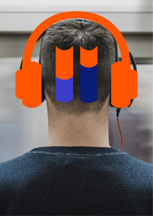
Проект «Проехали!» предлагает подарочную карту «Тройка-Литрес» для пользователей, которые часто проезжают свою станцию метро, зачитываясь аудиокнигами в приложении Литрес. Особенность проекта — использование GPS-трекера для выявления таких случаев и автоматического предоставления бонусов с скидкой на аудиокниги и месячным проездом.
Заплати за Хэппи энд
2
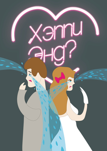
Ксения Савкина и Валерия Фомина разработали концепцию взаимодействия онлайн-кинотеатра и благотворительного фонда ИРСУ через донаты на финал сериалов. Проект предлагает зрителям платить за выход финальной серии, чтобы поддержать работу фонда, помогающего семьям.
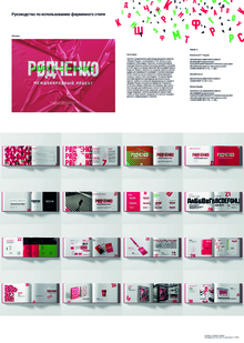
Мария Николаенко создала брендбук для международного проекта «Форма=Ракурс». Логотип сочетает зелёный и красный цвета, отражающие название проекта и фамилию Александра Родченко.
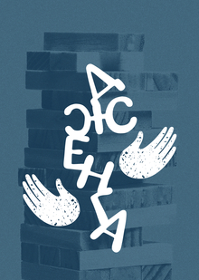
Дженга — концепт для фонда «Волонтеры в помощь детям-сиротам»
4
Софья Кулакова и Алиса Бабаева разработали концепт для фонда «Волонтеры в помощь детям-сиротам». Проект использует метафору игры в дженгу, чтобы показать, как внешние факторы могут разрушить семью и как фонд может помочь в трудных ситуациях.
hse.space
Unlock new opportunities in education, career, and creativity with HSE SPACE, the digital platform from HSE University. This online hub connects students, faculty, employers, and professional communities, empowering users to build dynamic digital portfolios, showcase extracurricular achievements, participate in competitions, and launch successful careers.
educational projects
extracurricular activities
startups
academic digest
We use cookies to improve the operation of the HSE website and to enhance its usability. More detailed information on the use of cookies can be fou...
Show more