
Introduction
Visual brand communication is largely built upon the use of enduring graphic imagery, allowing information to be conveyed without detailed textual explanations. One such example is McDonald’s «Follow the Arches» advertising campaign, developed by the Canadian agency Cossette in 2018. Its distinctiveness lies in using individual fragments of the Golden Arches trademark as navigational elements. Instead of the familiar complete logo, the brand utilizes parts of the golden arches to direct drivers toward the restaurants.
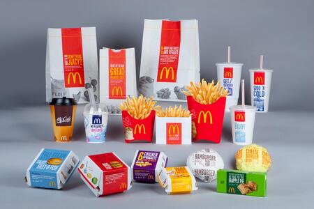
The topic selection is driven by an interest in how the recognition of a visual symbol influences the perception of an advertising message. For decades, the golden arches have been present in the visual landscape and have become one of the most recognizable elements of the McDonald’s identity. Thanks to accumulated experience interacting with the brand, the audience can recognize it even from an incomplete logo image. The «Follow the Arches» campaign is of interest for psychological analysis because it employs this principle in the context of roadside advertising.
«This advertising campaign is a humorous example of how recognizable these arches are, even when the consumer only sees part of the logo.» — Andrew Mamford, McDonald’s Regional Marketing Supervisor
The material selection principle is based on its connection to the campaign under investigation and the psychological mechanisms of influence. The bulk of the visual material consists of original advertising layouts from Follow the Arches, photographs of billboard placements in the urban and traffic environment, as well as footage from the campaign videos. For the analysis of the brand identity, additional images of the McDonald’s logo, color schemes, typographic samples, and graphic elements are selected. Historical photographs of restaurants and early versions of the golden arches are used to reveal the origin and development of the corporate symbol. Images of road signs and advertising structures are also examined to illustrate the conditions under which motorists perceive the advertisements. Supplemental illustrations are used to clarify theoretical concepts and are separated from the original campaign materials.
Research Hypothesis: The psychological impact of the «Follow the Arches» advertising campaign is based on the high recognition of McDonald’s golden arches, which has been established through their long-term presence in the visual environment. It is hypothesized that the accumulated associations between the brand mark and the brand allow the audience to recognize it even when the image is fragmented. This reduces the need to display the full logo and facilitates faster comprehension of the advertising message, which is particularly important in situations where drivers have only brief visual contact with outdoor advertising. Thus, the research aims to identify the relationship between the brand’s visual identity, the psychological aspects of perception, and the design decisions of the «Follow the Arches» advertising campaign.
Context
In 1953, Los Angeles architect Stanley Clark McMeen designed an elegant, futuristic McDonald’s restaurant featuring two golden arches on either side.
The key to understanding the campaign lies in the history of the McDonald’s symbol itself. The Golden Arches were initially associated with the architecture of the chain’s restaurants, but they gradually evolved into a standalone element of the corporate identity. Over time, the mark became so recognizable that a complete reproduction of the logo was no longer required to identify the brand.
The Evolution of the McDonald’s Logo
By the time «Follow the Arches» was created, the golden arches already existed in the audience’s collective visual memory as a stable McDonald’s identifier. This accumulated cultural capital became the foundation of the advertising concept.
Instead of creating a new graphic image, the authors turned to existing visual codes. They altered the familiar way of presenting these elements: the arches were enlarged, cropped, and positioned to resemble road signs.
Socio-spatial context
The «Follow the Arches» advertising campaign was created in Canada in 2018 by the agency Cossette for McDonald’s Canada. Its existence is tied to the specific characteristics of the urban and road environment, where fast-food restaurants compete for the attention of people on the move. Automobile routes, intersections, and highway exits become crucial points of contact between the brand and the potential consumer. In such a context, outdoor advertising fulfills not only informational and image-building functions but can also help people orient themselves within the space.
One of the prerequisites for creating this campaign was the inconsistency of existing directional signs guiding drivers to McDonald’s restaurants. Cossette agency representatives observed that in various cities and settlements across Canada, signs used varied in design and did not form a unified visual system. Since the brand itself possessed a recognizable graphic symbol, this could be leveraged to create a more coherent navigation method. Therefore, the advertising objective was not only to capture attention for McDonald’s but also to simplify the process of finding the nearest restaurant.
The primary audience for this campaign consisted of drivers and people in transit. Unlike pedestrian advertising, which may be viewed for a longer duration, roadside advertisements often enter someone’s field of vision only for a brief moment. A driver must simultaneously monitor the road, road signs, other traffic participants, and the surrounding environment. Therefore, advertising information in such an environment must be concise, high-contrast, and easily recognizable. An excessive amount of text or complex graphics hinders quick message comprehension.
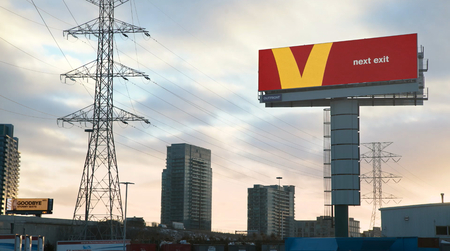
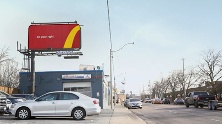
Visual components of the advertising campaign
The defining characteristic of the «Follow the Arches» campaign’s visual design is the reinterpretation of the McDonald’s corporate logo. Instead of using the complete golden arches, the designers utilized individual fragments of the logo, transforming them into standalone graphic elements. This approach allowed for the creation of a navigational system built upon the brand’s existing visual identity. The creators' intent was that the symbol’s recognizability is so high that even a small part of it is sufficient to identify McDonald’s.
Variations for adapting the «Follow the Arches» visual principle for different languages and directional flows.
Color Palette The campaign’s visual system is based on McDonald’s corporate color palette, primarily the combination of yellow and red. The golden arches serve as the main graphic accent, and the contrasting background helps highlight their silhouette. Using familiar colors maintains a visual connection to the brand and ensures uniformity across all promotional materials. In this context, color serves not only a decorative function but also plays a role in identifying the advertising message. The campaign creators noted that using the corporate colors and fragments of the logo helps make the system recognizable and adaptable to various markets.Composition and Framing The advertising layouts are built on minimalism and large-scale graphic elements. Fragments of the golden arches occupy a significant portion of the advertising space and frequently extend beyond the borders of the composition. This framing creates a sense of the form continuing beyond the medium, emphasizing its directionality. The composition avoids complex decorative elements or product imagery—the primary focus is on the graphic symbol and a concise text message. Negative space helps separate the main elements and facilitates the perception of the layout from a distance.
Text and Typography In the campaign, text serves a supporting function, complementing the graphic element with specific instructions. Short phrases are used in advertising mockups: «Next Exit, ” „On Your Right, ” „On Your Left, ” and „Just Missed Us.“ The conciseness of the phrasing aligns with the requirements of the advertising placement—the driver does not need to read a long message to grasp the meaning. The text does not compete with the logo for attention; rather, it clarifies the direction indicated by the graphic form. Meanwhile, the typography maintains simplicity and legibility, fitting the overall minimalist composition.
Psychological Mechanisms of Influence
Visual Memory and Pattern Formation A familiar image is capable of activating an entire system of associations formed based on prior experience. In the case of McDonald’s, the golden arches serve as that stimulus. Due to their long-standing presence in the visual environment, they are firmly associated with the brand. Therefore, in the «Follow the Arches» campaign, even just a fragment of the logo is enough to recognize McDonald’s.Repetition and Association Reinforcement Repeated exposure to visual stimuli strengthens the connections within memory patterns. The long-term use of the golden arches in advertising, restaurant design, and packaging has established a robust association between the graphic symbol and the brand. The campaign leverages the audience’s existing visual experience, allowing it to forgo a full depiction of the logo.