Concept
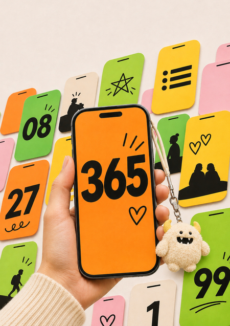
Advertising is increasingly spreading not through billboards or brand accounts, but through consumers’ personal profiles. People post year-end summaries from apps, the number of consecutive days they’ve studied, or unboxing videos of toys. On the feed, this looks like a personal narrative, but in reality, it functions as advertising. The scale of this phenomenon is clearly visible in the example of Spotify: according to company executives, the Wrapped 2025 campaign garnered over 630 million reposts [21].
Sociology and marketing usually explain why people want to share this—it’s about showing one’s taste and belonging to a group. But I am more interested in the other side—the visual. The desire to show something to others doesn’t create a post. The image must look good in the frame, be engaging when viewed on a phone screen, and remain recognizable. I examine brands’ design decisions—color, typeface, composition, form, and mascots—through the lens of visual perception psychology.
This observation changes the designer’s brief. A classic advertisement must convince the viewer, whereas the image being shared must first appeal to the person posting it. The author on the profile is no longer the brand, but an ordinary person, so the design must read as that person’s statement. If the advertising is too obvious, the post casts a shadow over the poster’s taste. If the brand disappears entirely, the company gains nothing. The design here balances two interests: the person wants to talk about themselves, and the brand wants that story to be recognizable.
This issue is particularly timely now because the phone screen has become the primary venue for visual encounters. Users scroll quickly through feeds, reading almost nothing, and Stories disappear after 24 hours. What wins is what is immediately understandable and what one wants to show friends. This is why I am interested not in the virality itself, but in the specific design solutions that compose this form.
Key Question: what visual elements prompt someone to share it as their own content?
Hypothesis: Design increases the likelihood that a user will post an advertisement as their own content, provided four conditions are met simultaneously. I consider these conditions necessary, but not sufficient: form cannot succeed without content valuable to the user.
4 conditions:
1. Personal Trace:
The image contains elements specific to an individual: a name, data, choices, and a unique composition.
2. Recognizable Without a Logo:
The brand is recognizable through consistent visual cues, so the publication does not look like an advertisement.
3. Instant Impact:
The image or object is instantly readable on a small screen and looks excellent in the frame.
4. Standard Template, Varied Content:
All versions are built using a single template, allowing them to form a cohesive series in a feed.