Pollen is a publication that shares news from the world of field plants with other plants.
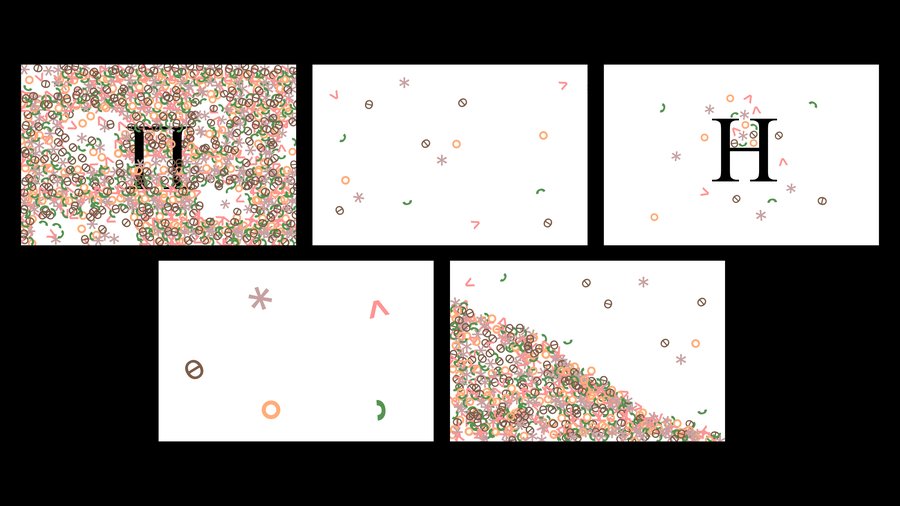
Redesign with AI
«Pollen» is a publication featuring news from the world of field plants, created for the plants themselves. It covers field life, pollinators, blooming cycles, seasonal changes, and natural events. The project transforms the familiar world of botany into an autonomous media environment with its own informational space, character, and visual language.
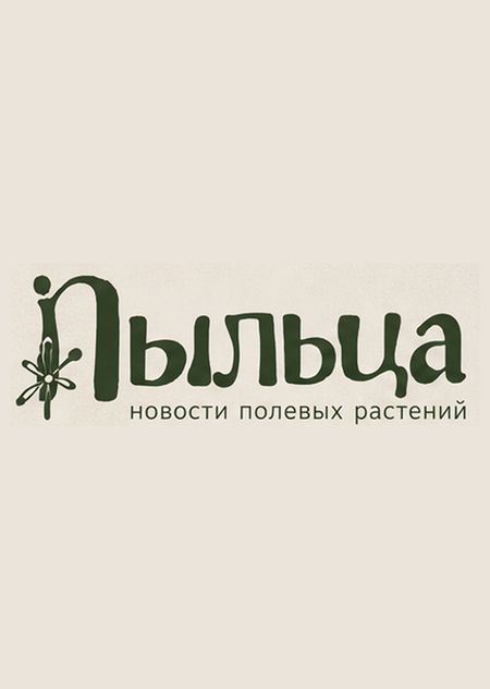
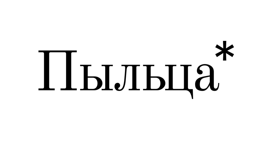
Logo
Design a distinctive logo for «Пыльца, ” a Russian newspaper dedicated to wild flora. Combine elegant editorial typography with a subtle botanical symbol inspired by pollen, wildflowers, or seeds. Create a refined, contemporary identity that evokes the feeling of an independent nature magazine, rather than a flower shop. Use deep meadow green, warm cream, and muted pink accents. The design must feature a clean composition, balanced lettering, a memorable silhouette, high legibility, and professional vector quality. Keep the brand name exactly in Cyrillic: „Пыльца.“ No extra text, no distorted letters, and no mockups.
Color Palette
Typefaces
Graphic Elements
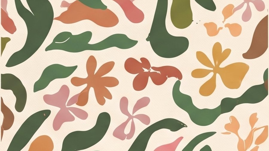

Create a cohesive set of seamless patterns and graphic elements for «Pyltsa, ” a Russian newspaper dedicated to wildflowers. Employ an elegant botanical editorial style featuring organic silhouettes of wildflowers, petals, seeds, pollen grains, leaves, and delicate hand-drawn botanical illustrations. Combine flowing organic shapes with subtle vintage print textures and refined contemporary graphic design. Color palette: deep meadow green, warm cream, dusty pink, muted terracotta, soft peach, and mustard yellow. Include repeating patterns, isolated botanical symbols, decorative lines, icons, and abstract pollen-inspired shapes. The aesthetic should be warm, natural, sophisticated, and playful without being childish. Flat vector graphics, clean shapes, a consistent visual language, and a professional brand identity presentation on a warm cream background. No mockups, no 3D, no gradients, and no extra text. High resolution, crisp details.
Photography Style
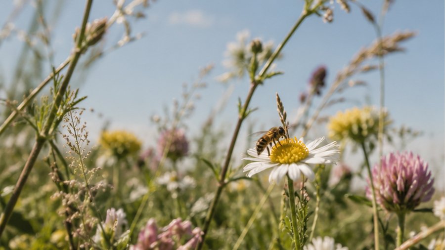
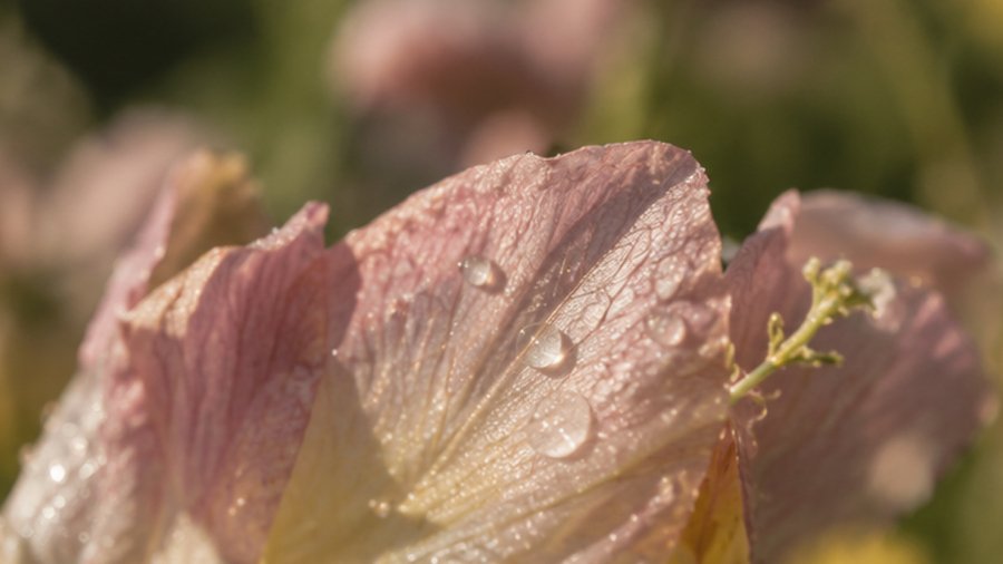
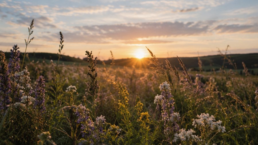
Identity
Create a complete visual identity system for «Пыльца, ” a Russian newspaper focused on wild plants. Develop a cohesive botanical editorial identity inspired by independent magazines, vintage print culture, wildflower photography, and the concept of a meadow as its own media ecosystem.
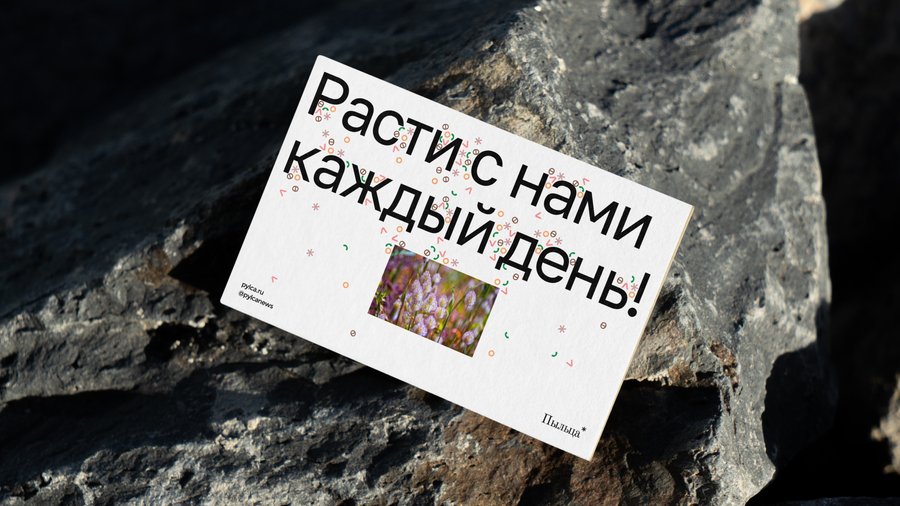
Include the primary logo, alternative logo versions, a botanical symbol, a color palette with HEX codes, Cyrillic typography, seamless patterns, graphic elements, icons, editorial layouts, newspaper covers, posters, social media graphics, and branded merchandise.
Use a harmonious palette of deep meadow green, warm cream, dusty pink, muted terracotta, soft peach, and mustard yellow. Combine elegant editorial typography, organic botanical silhouettes, delicate hand-drawn illustrations, subtle paper textures, and contemporary grid-based layouts.
The identity should feel natural, intelligent, distinctive, slightly nostalgic, and sophisticated—like a genuine independent nature publication. Balance expressive organic shapes with clear typography and structured editorial design. Present everything in a professional brand identity board featuring realistic mockups, consistent art direction, generous whitespace, and high-quality imagery.
IMPORTANT: Keep the brand name exactly in Cyrillic: „Пыльца.“ Preserve correct lettering and readable typography. All visible text must be in Russian. Avoid distorted letters, random text, childish illustrations, generic eco-brand clichés, or unrelated decorative elements. High resolution, crisp details, premium art direction, cohesive visual system.
Merchandise and Carriers