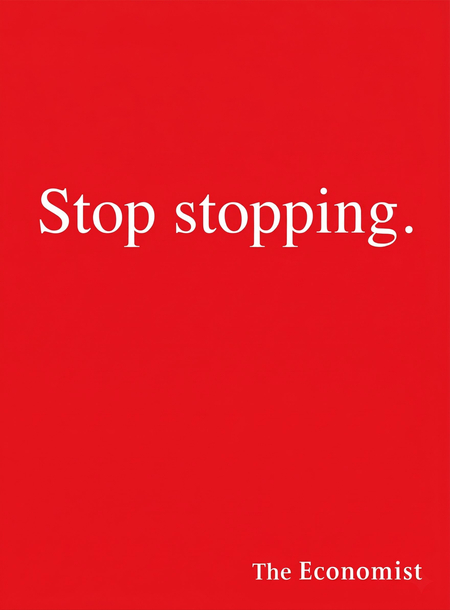
IntroductionIn today’s visually saturated world, people are fatigued by overly detailed advertising. In an environment where every medium—from a street billboard to a smartphone feed—is literally «shouting» about a benefit, capturing an audience’s attention becomes increasingly difficult. While most companies strive to make their advertisements more ornate, colorful, and technologically advanced—including through the application of artificial intelligence—only a few seek solutions in simplicity. Curiously, this minority often achieves greater success: concise advertisements not only resonate with the target audience but also establish a kind of mainstream that people discuss online and even attempt to imitate.For instance, brands like Apple, IKEA, or McDonald’s utilize a simple visual language and consistently achieve high results, partly due to their recognizable and discussed advertising campaigns. Their primary tool is conveying the core message through color, form, or imagery—the interpretation of the product and its components. However, none of this can exist in isolation; the foundation of success lies in the correct combination of a small number of elements and the meaning embedded within each one.The object of this research is visual advertising from the late 20th to early 21st century across print, out-of-home media, and digital environments. The subject is the techniques of minimalism and their influence on audience memorability and emotional response.Key Research QuestionWhy is simple advertising often the most successful, and through what visual, semantic, and psychological solutions does minimalist advertising become more noticeable, understandable, and memorable than advertising that is technically and visually more complex?
HypothesisThis study operates on the premise that the fewer visual elements a promotional message contains, the higher its chance of being noticed and remembered. Simplicity, in this context, is not a rejection of expressiveness, but rather its concentration: minimalism is expressed not merely through fewer elements, but becomes possible and effective only when it is supported by a strong brand identity, a precisely constructed message, known principles of human perception, and an accurate definition of the target audience.Research StructureThe research is structured around the principle of analyzing and proving the hypothesis: each chapter reveals the tools used to build successful minimalist advertising. Each subsequent chapter builds upon the previous ones, forming a causal chain that creates a complete picture of how advertising campaigns emerge and what they are built upon. Major conclusions are drawn using examples from well-known global advertising cases, culminating in a unified conclusion—either confirming or refuting the theory.
Navigation
- The Role of Brand Elements in Advertising
- Product Interpretation
- Ambiguity or Wit in an Advertising Campaign Concept
- The Psychology of Minimalism Perception
- Conclusion
The Role of Brand Elements in Advertising
Initially, and to this day, minimalism is perceived through subtraction: removing superfluous text, secondary imagery, and explanatory notes. However, subtraction is only possible under one condition—the viewer must independently reconstruct what is missing or infer the advertisement from the available elements; otherwise, it becomes meaningless. Therefore, it is fundamentally important to carefully select those very details, building a strong and recognizable brand identity where every element is not merely placed, but is substantiated both by the core concept and by other visual elements. In this way, any carrier remains an advertisement for a specific brand only because the brand’s defining «markers"—the key elements without which no brand can exist—are not removed.
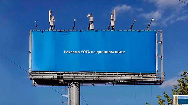

For example, Yota operator’s campaign in 2017 presented one of the most minimalist campaigns. Billboards, magazine spreads, and banners were completely saturated with the company’s corporate color, with only a brief caption breaking up the monochromatic media: «This is Yota advertising on…» (followed by the specific medium). There was no product, no offer, and no mention of benefits. This advertising seems inherently weak, as it contains only a simple, even obvious message—with only the brand name remaining from the advertisement. However, this advertisement immediately captured the audience’s attention. And here is why: on the medium, the Yota company left two main «markers» of its corporate style that are immediately recognizable by the viewer: the blue background, the company’s signature color, and the brand’s concise typeface. Due to the absence of other identity elements, when viewing the media, the consumer reads the essence—the company name and the blue background, which is also associated with the brand.

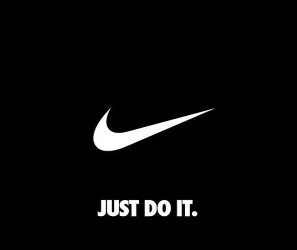
Nike’s «Just Do It» advertising campaign, launched in 1988, serves as a second example. Here, the brand identity is built on an extremely concise set of elements: a three-word slogan, the Swoosh logo, and recognizable typography (the bold Futura Bold Condensed typeface). Thanks to the brand’s unchanging style, these elements function independently: many layouts omit product imagery, and the Swoosh often appears without the company name because the audience instantly recognizes it as the Nike mark. Simultaneously, the universally known slogan does not describe the product; rather, it articulates a motivational premise that the viewer relates to their own experience—this mechanism has persisted for over thirty years, ensuring emotional consumer engagement with minimal text.
ConclusionThus, minimalism most often succeeds due to the presence of established brand identity elements—elements that not only are recognizable to the consumer but which, when combined, do not create visual clutter. This allows the viewer to focus on the essential message and absorb the necessary information in mere seconds. Nevertheless, the corporate elements referenced here must be stable visual motifs that do not require explanation: these are typically color, logo and its geometry, typography, and the shape of the product and its packaging. The stronger the element is tied to the brand, the fewer explanations are needed for recognition. From this, it can be concluded that minimalism is only possible with a well-designed brand style and its consistent application across various media. Minimalism works in an advertising campaign only if the reduction in stylistic elements does not negatively impact how the target audience perceives it.
Product Interpretation
Furthermore, minimalist advertising succeeds not only because it has few elements, but because the sole remaining element—the product itself—begins to function as a carrier of meaning. Its form, texture, packaging, or method of use ceases to be an object of display and becomes a sign, the primary bearer of the campaign’s concept. Here, the product itself undergoes a reinterpretation without losing its original function. To confirm this pattern, it is sufficient to examine the advertising campaigns of several brands.
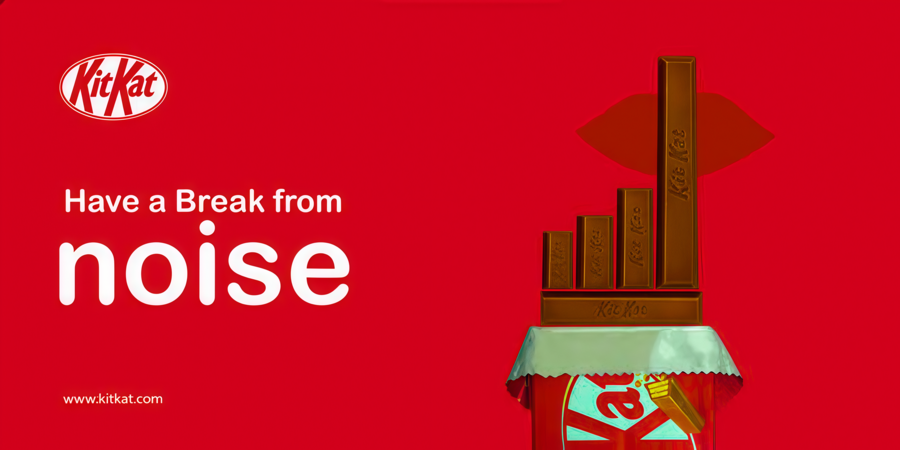
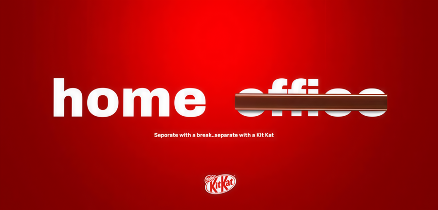
Indeed, thanks to the «Have a break» advertising campaign, KitKat became the top seller of sweet bars. The candy bar itself served as the foundation for the advertising; however, the company didn’t simply display its product on various media. Instead, it adopted the bar as the primary visual motif. The bar becomes a universal module—one that not only composes various objects but also exists as a standalone entity, assuming the role of another object. Thus, the KitKat «finger» can function as a widely recognized gesture—a line crossing out a word—or as a finger on a hand. The consumer instantly perceives this image because these objects are part of a universally understood symbolic system that any person immediately registers on a subconscious level, eliminating the need for extraneous elements or explanations. Meanwhile, the product itself remains actively featured in the campaign, ensuring its recognition is not diminished.
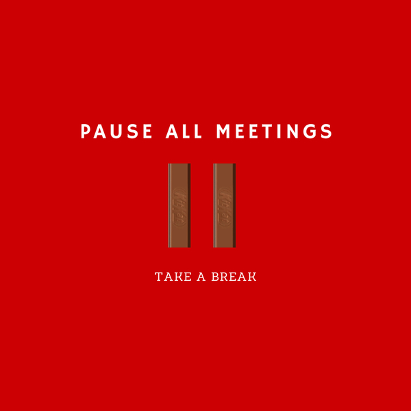
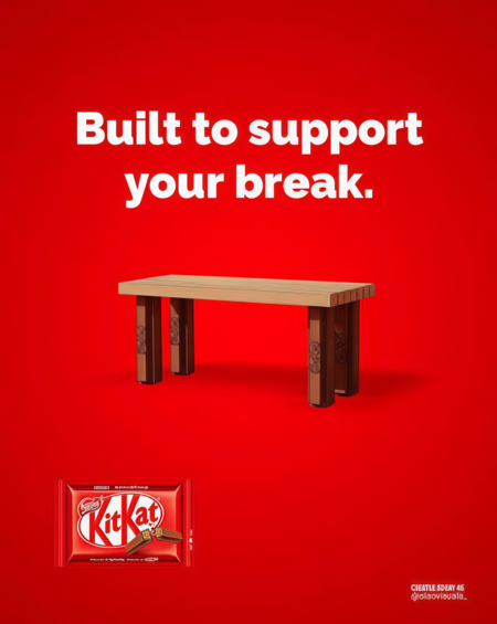
The KitKat bars were not only used as «building materials» for the new structure and signage but also formed a cohesive system, transforming, for example, into a keyboard. However, even after the bars were transformed, the form and the product remained recognizable to the consumer—a result of the absence of global transformations and other brand elements that, as mentioned previously, form a strong foundation for recognition.


Another unique product interpretation that became a key motif not only in the advertising poster but in the entire Lays campaign. Specifically, the company focused on the shape of the chip and found a smile within it, which later became the basis for all the packaging. The short message, «Just smile, ” merely clarifies the message embedded in the visual identity, yet the shape itself is immediately recognizable to the consumer.
LEGO is the purest example of using a product in an indirect sense in advertising, as the brick itself is inherently a medium of interpretation. The block represents nothing until a unified object is assembled from a multitude of parts. Nevertheless, the object in the example is fictional, and each person evokes their own set of associations with it. In this instance, the text serves as the primary tool for correctly interpreting the advertisement: the slogan functions not merely to clarify, but to connect. It is presented as a line from a parent of a child who assembled an arbitrary hero from the available parts (which can be understood through the parentheses on the right, mimicking «bubble» text used for visual styling).
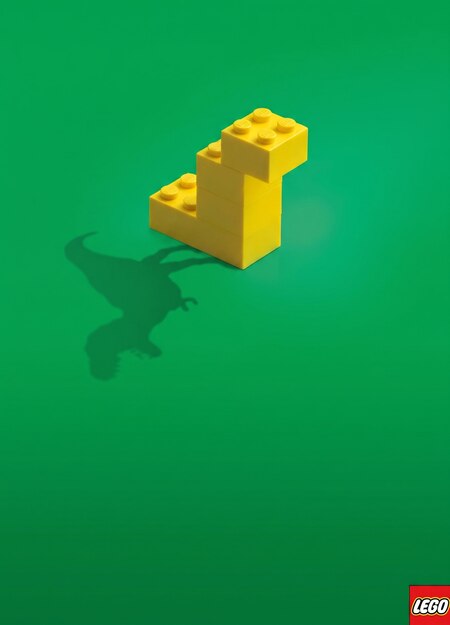

In another series, a simple cube construction casts the shadow of a dinosaur, airplane, or other objects. The product is shown literally (the silhouette is assembled from several pieces), and its interpretation is placed in a separate layer of the image—the shadow falling from the silhouette onto the surface. Thus, the model itself, assembled from cubes separately from the shadow, is too schematic and illegible at first glance, and here the shadow takes on the role of an explanatory element.
ConclusionThus, we can say that interpreting the product is a winning strategy in minimalist advertising: it helps both preserve the brand’s identity by conveying the most important elements (what the brand directly produces) and reduce the number of elements by focusing on the visual image of the product itself and its reinterpretation within the advertising campaign. This implies that the emphasis in advertising does not shift, but rather centers on the main object, which makes a concise advertising campaign successful and memorable.
Ambiguity or wit in the advertising campaign concept
It is often assumed that advertising must explain: it must present a product, list its merits, and guide the viewer toward a desire to purchase the item in some manner. Nevertheless, the unspoken message often proves more potent than the explained one. When an audience does not immediately feel compelled to buy something, they construct the meaning themselves, becoming co-creators of the advertisement. The pleasure derived from deciphering a joke, grasping a concept, or completing the implied meaning is then transferred to the brand, embedding itself firmly in the minds of the target audience.