Original size 1140x1600

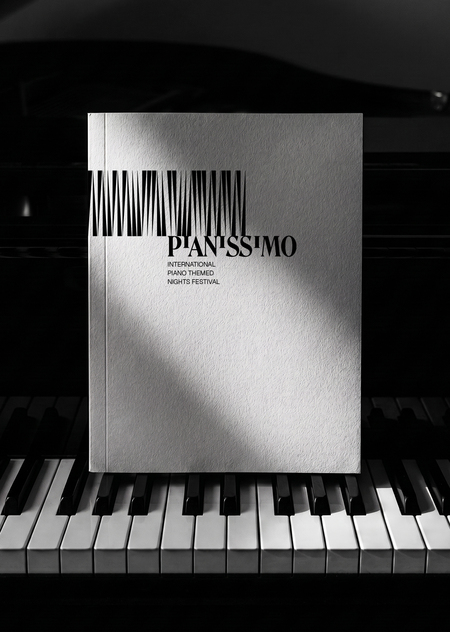
Official Style Guide for the International Piano Music Festival

PROTECT STATUS: not protected
Longread translated automatically

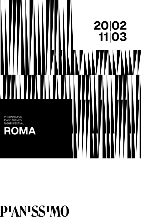
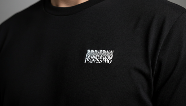
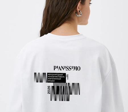
As part of the generative graphics course, a brand identity concept was developed for the international Pianissimo Piano Music Festival. The festival’s characteristic graphics and identity were generated based on piano melodies. This design serves as an extension of the black-and-white key motif established in the logo previously created by Olga Sil and Kirill Martyanov.
big
Original size 320x213


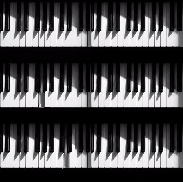
The core of the visual identity is based on observing the expressive rhythm of the shadows created when piano keys are pressed. The piano melody itself directs the play of these shadows within the developed graphics.

The main graphic constants of the style are the generative pattern, the typography, and the black-and-white color code.


Original size 1920x783


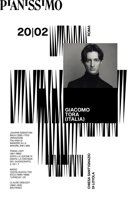
Posters are assembled on a unified grid in TouchDesigner, with the capability for random placement of pattern blocks, performer photographs, and text. Animated versions of the posters have been created for social media and online press.


Original size 1920x1080
Loading...

A distinctive feature of the festival is the selection of concert venues. Each time, the locations are unconventional—ranging from art museums to abandoned factories or contemporary art spaces. Therefore, it was crucial to create an identity that could seamlessly integrate into any stylistic environment.
Original size 4500x3000
Original size 5120x3584
Original size 4500x3200
Official Style Guide for the International Piano Music Festival
Кейс по айдентике музыкального фестиваля: фирменный стиль фестиваля фортепианной музыки Pianissimo основан на генеративной графике, созданной на базе фортепианных мелодий и ритма теней клавиш. В проекте выполнены генеративный паттерн, дизайн серии плакатов с модульной сеткой в TouchDesigner, а также анимированные постеры для соцсетей и онлайн-медиа. Автор — Мария Кораллова.
Project description created with AI
Project created at 27.07.2026
More projects in identity & branding
Maksim Seredkin Alekseevich
Ребрендинг маслодельни «Живое масло» был сделан с целью увеличения охвата аудитории в социальных сетях. Совместно с командой проведён комплексный анализ медиаполя и конкурентной среды, выполнена сегментация целевых аудиторий, сформулированы основные сообщения и подобраны оптимальные каналы их распространения, предложены варианты ребрендинга, создан лендинг в конструкторе сайтов Tilda.
hse.space
Unlock new opportunities in education, career, and creativity with HSE SPACE, the digital platform from HSE University. This online hub connects students, faculty, employers, and professional communities, empowering users to build dynamic digital portfolios, showcase extracurricular achievements, participate in competitions, and launch successful careers.
educational projects
extracurricular activities
startups
academic digest
We use cookies to improve the operation of the HSE website and to enhance its usability. More detailed information on the use of cookies can be fou...
Show more