Navigation Menu
- Concept
- Soviet Visual Tradition 2.1 Character Archetypes 2.2 Poster Composition 2.3 Color and Graphic Style
- Comics and Hollywood Action 3.1 Hyperbolization of the Figure and Dynamics 3.2 Action Tropes and Visual Quotes 3.3 Parody
- Post-Soviet Street Aesthetics 4.1 Urban Environment and 90s Visual Markers 4.2 Criminal Archetypes 4.3 Music Video Editing and VHS Aesthetics
- Conclusion
1. Concept
The animated series «Captain Pronin» holds a unique place in the history of early 1990s Russian animation, demonstrating a transition from traditional Soviet aesthetics to the new visual practices of the post-Soviet era. The series emerged during a time of radical social, economic, and cultural change: the country was undergoing a transformation of familiar daily life, and popular culture was being saturated with new images arriving from the West. Within this context, the visual language of the cartoon series is shaped as a product of the collision between various cultural codes, where the traditions of domestic animation and cinema meet new visual practices that reflect both global and local influences.
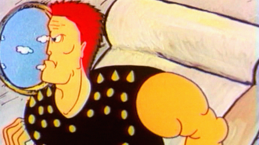
Captain Pronin flies to America. Episode 2
The series was created by the creative group «Ekran» in 1992, with Mikhail Zaitsev serving as the director and originator of the idea. He is known for his work on the short animated films «The Rules of the Game» (1990), «From the Cannon to the Moon and Beyond Without Stopping» (1990), and his involvement in the animation projects of the «Funtik» series in the 1980s.
Creative Collective «Screen» / Picture Union
«Captain Pronin» doesn’t simply tell a superhero story; it constructs a complex visual environment where various forms of imagery intersect. The frame composition, character staging, color palette, and editing work to forge a feeling of a world that is simultaneously recognizable and hyper-stylized—familiar yet ironic. This world feels like a dynamic hybrid, where every detail—from the architecture of city streets to the heroes' movement—carries the imprint of cultural influences. Crucially, the series' visual language simultaneously captures the nuances of everyday reality, references past traditions, and ironically quotes Western cinematic tropes. The study gains particular value from the fact that the series allows for the analysis not only of content but also of the forms of visual expression.
Captain Pronin. Episode 1
Animation becomes the tool through which cultural blending is expressed: the hyperbole, stylization, and caricature of characters create a unique hero identity, while the montage and frame rhythm amplify the perception of their image. All of this makes Captain Pronin an example of visual experimentation, in which every scene and every character gesture is subordinated to the study of complex visual interplay.
What visual layers merge in the series, and how does that affect the perception of the protagonist?
To answer this question, we will examine the series not just as a cultural product, but also as a visual experiment, where every scene and every character can serve as a source of information regarding the complex interaction of cultural strata. Throughout this study, we will identify these layers, analyze their interplay, and demonstrate how visual hybridity forms the unique image of Captain Pronin, reflecting the cultural transformations of its era and the emergence of a new aesthetic in Russian animation art.
Captain Pronin, Earthling. Episode 3
2. Soviet Visual Tradition
2.1 Character Archetypes
Captain Pronin. Episode 1
One of the most significant features of Captain Pronin’s visual language is the clear typology and character recognizability—a technique inherited from the traditions of Soviet animation and cinema. Because the series is conceived as a parody and simultaneously an attempt to reinterpret the «heroic» image in a new era for Russia, the characters are reduced to «archetypes»: the hero, the villain, the swindler, the rival, the «bad boy.» Their outlines are sharp, their silhouettes are expressive, and their forms are concise. This visual reduction enhances the comedy, emphasizes character, and strengthens the perception of the protagonist as a symbol rather than a realistic character.
Operation «Putana.» Episode 1
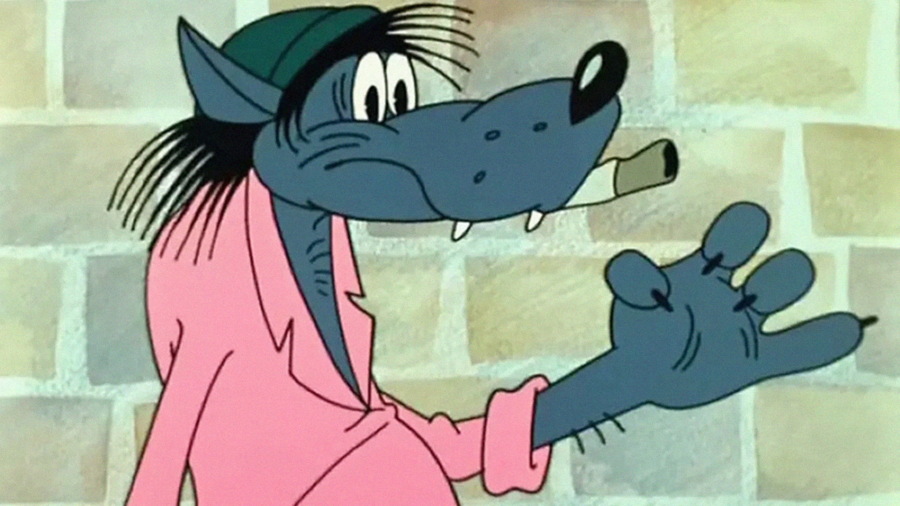
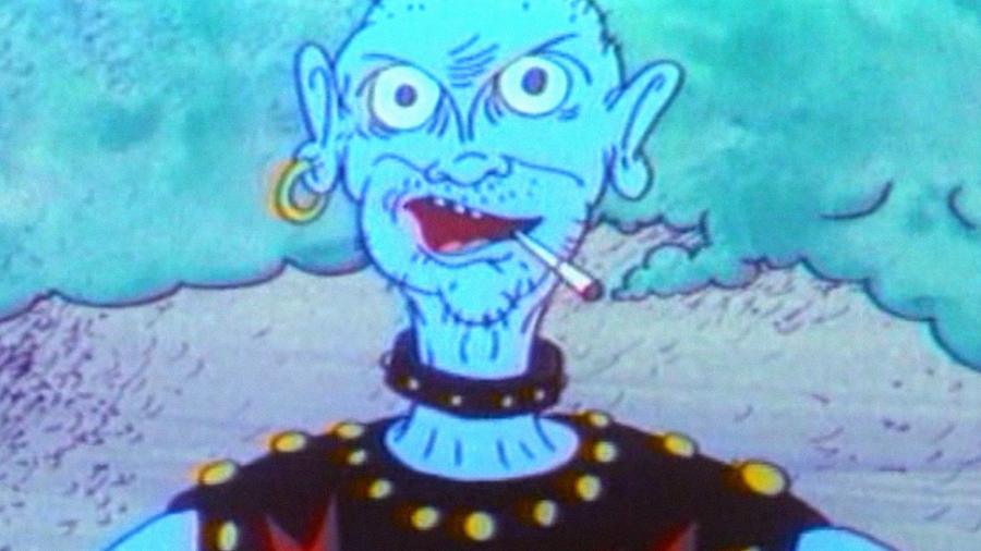
Whistle. Episode 1 / Nu, Pogodi! Episode 1
Chief. Episode 1
Through this technique, «Captain Pronin» maintains a connection with the domestic school of animation, where composition, character archetypes, and clarity are the cornerstones of visual storytelling. Simultaneously, the series uses this foundation to playfully subvert cliché imagery, making it both recognizable and ironic: it seems to tell the viewer, «Yes, you know who the hero is, who the villain is, who is 'one of us'.» Within the context of post-Soviet cultural and visual transformation, this takes on additional meaning—the hero is no longer merely a Soviet «good policeman,» but a comic, super-cop of a changing era, where the symbol and the moment matter more than realism or depth.
«This is much better.» Episode 1
2.2 Poster Composition
In «Captain Pronin,» the influence of poster aesthetics characteristic of Soviet animation and 1970s–1980s film posters is evident. The hero is often presented in a composition reminiscent of a poster—frontally, with clear centering, set against a backdrop of urban architecture or iconic landmarks. This presentation reinforces his status as a symbolic character and makes the frame visually comprehensible and expressive.
Captain on the way to «Camel.» Episode 1
The Captain is in his office. Episode 2
Framing and composition are used not only to highlight the protagonist but also to construct scenes of interaction with groups of characters—such as police, city residents, or antagonists. Group scenes are organized with clear centering, allowing the viewer to immediately identify the «main» and «secondary» characters.
Myshyakovich’s Dental Assistants. Episode 1
2.3 Color and Graphic Style
Captain Pronin was cornered. Episode 1